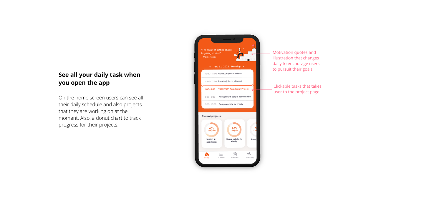
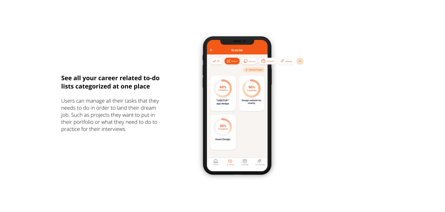
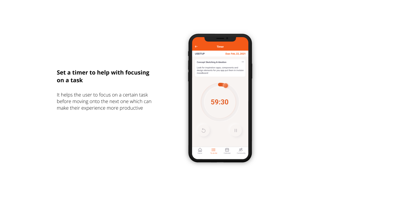
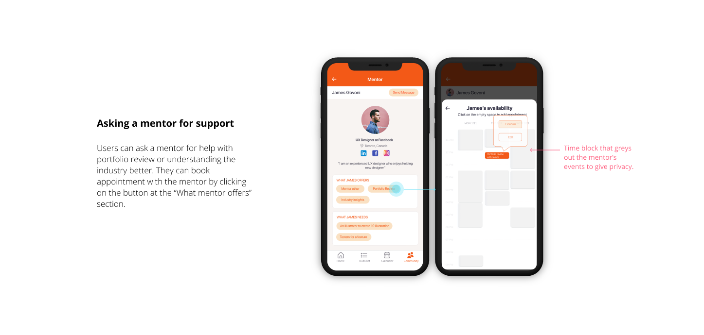
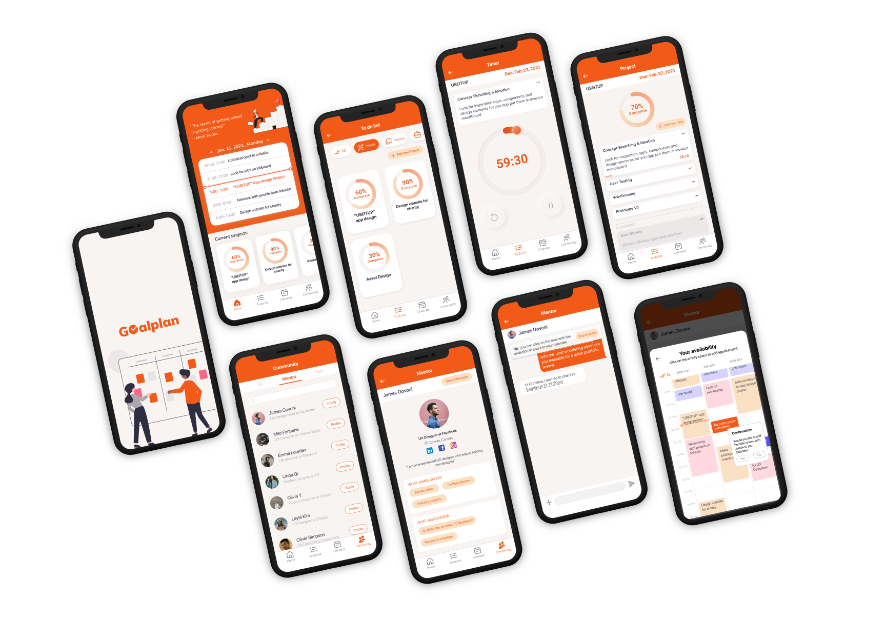
Goalplan is a task management app designed to help new UX Design graduates to track their tasks that they need to finish every day, such as freelance work, when to practice interview, and meeting with a mentor or peer so that they can feel supported and motivated when pursuing their career goals.
Problem Space
Design students experience a lot of stress and uncertainty upon graduation.
Many new UX Design Graduates do not know how to get support or how to continue developing their skills outside of an established school program. In addition, these graduates may feel isolated without a community. These students do their best spending a lot of time on LinkedIn but find that the content is primarily focused on designers who have broken into the field. For all these reasons it's clear how many new graduates experience high degrees of stress and is at risk of losing hope of entering their field.
Challange
How might we help new UX design graduates with continuing their professional development by providing them with a place where they can track and develop their professional goals with support from mentors and peers?
Primary Research
Interview with my users to understand their goals and frustrations
The research goal is to understand what are the struggles and goals new UX Designer have after graduation. In order to conduct the interview, I found 4 new UX designers through Linkedin who has graduated within 6 months. The reason I choose to focus on graduates that graduated within 6 months is that they are relevantly new graduates but at the same time had enough experience to share. The following are some Insights I have found from my interview with those participants, they are prioritized in order of severity.
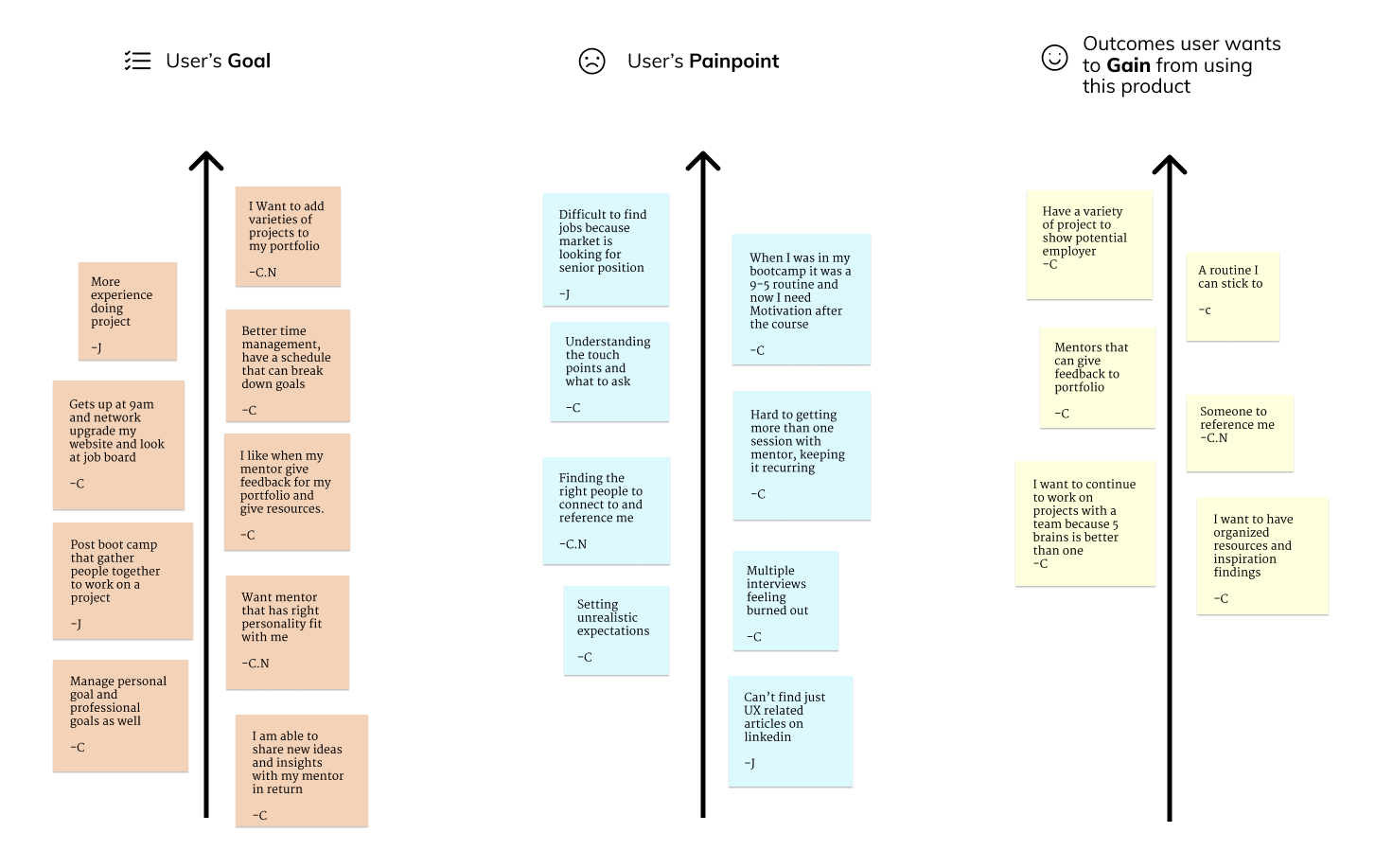
Based on those interview insights I have synthesized them into three main themes:

PERSONA & EXPERIENCE MAP
keeping my user at the center of my design process
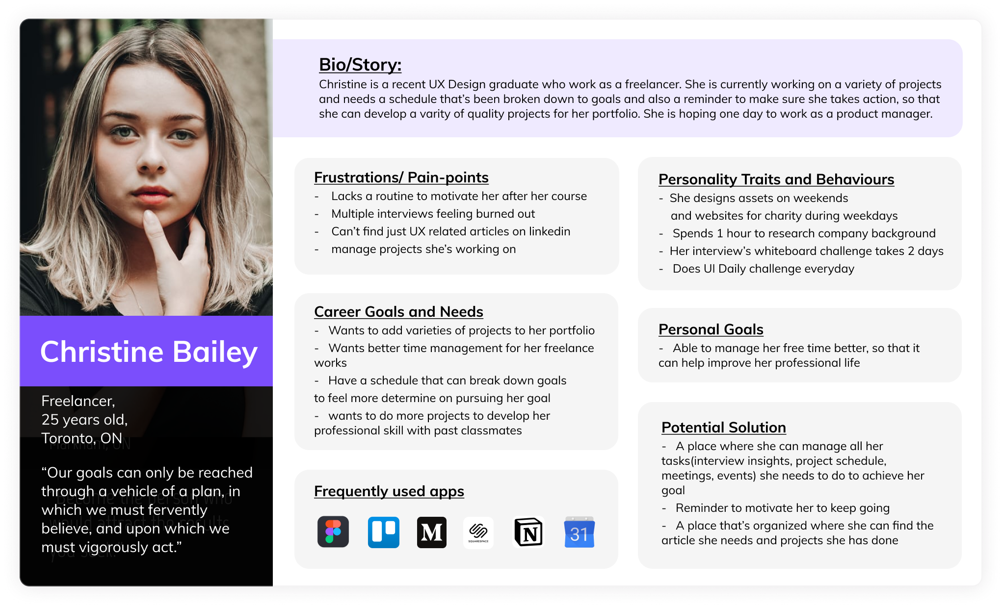
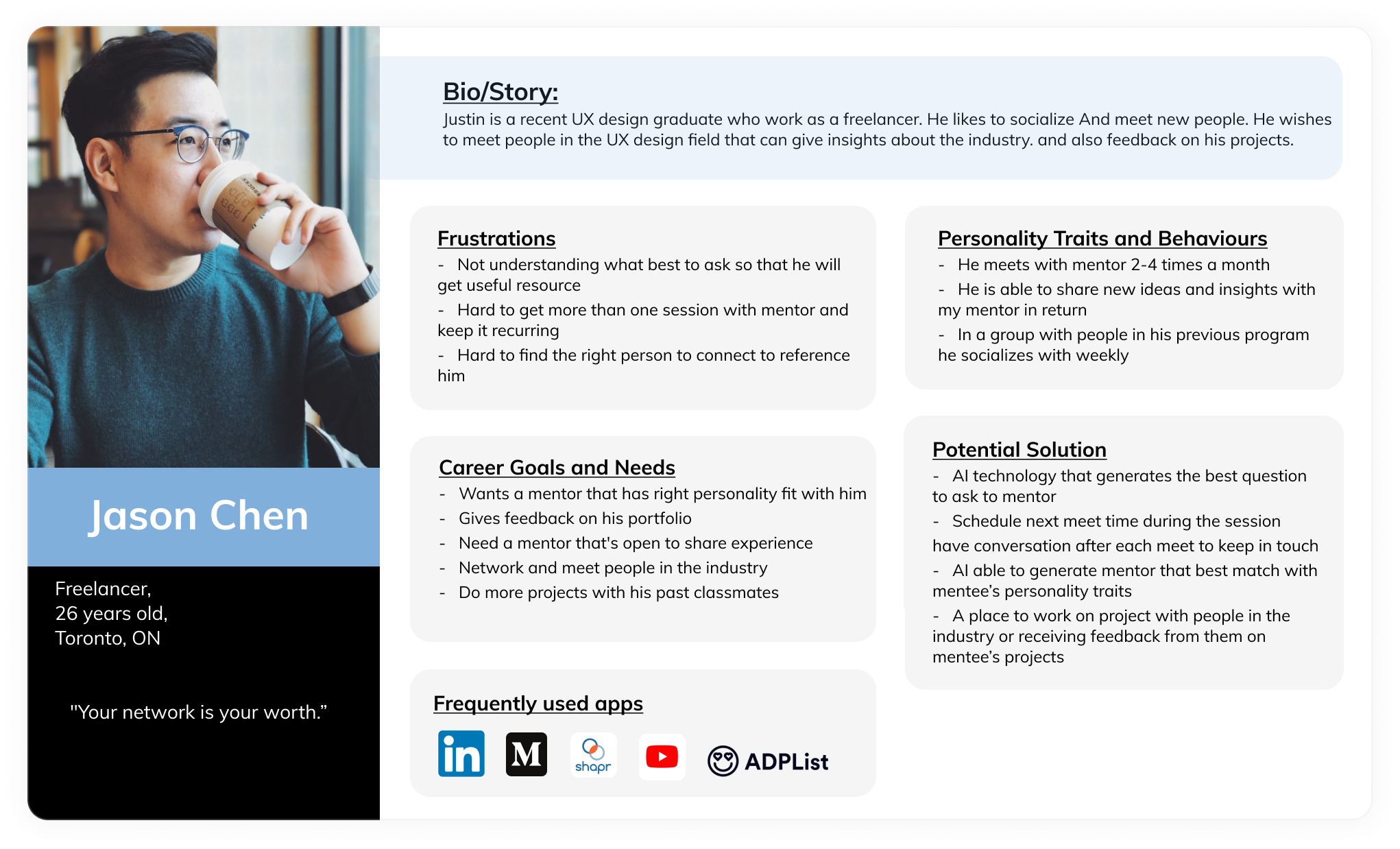
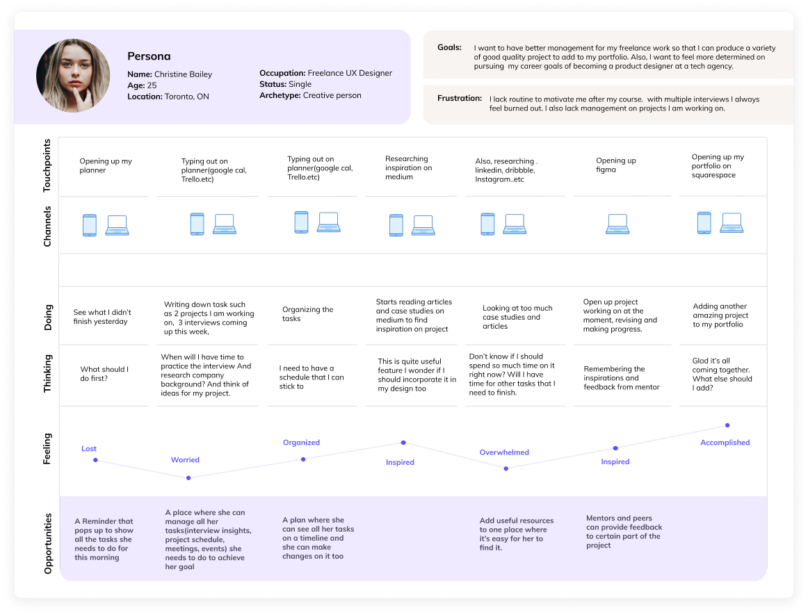
I have organized those three themes into two personas. During my design process, I often come back to those two personas and the experience map to remind me whats the users' goal and frustration which guides me through my design choices. My primary persona Christine Bailey is created based on the theme manage professional development and my secondary persona Jason Chen is based on the theme of mentorship.
Primary Persona and Secondary Persona (Click on the arrow to see secondary persona)
Experience Map
USER STORY
To create a feature based on the end user's point of view
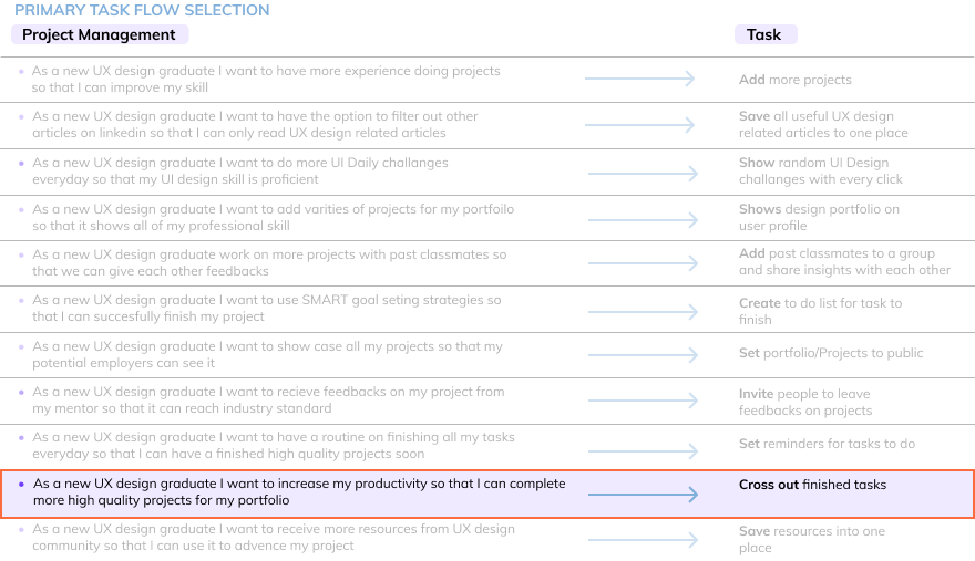
I have created 10+ user stories from the point of view of my primary persona Christine. I wrote them In the form of "As a UX design graduate, I want to________________ so that________________ ." It puts me in her shoes to understand whats her goal and what outcome she wants to achieve so that I can design features on this app to help her achieve her needs in the user story. I then picked the user story that's most important (Highlighted in purple below) for her to achieve her career goal, then created a primary task flow based on it.
TASK FLOW
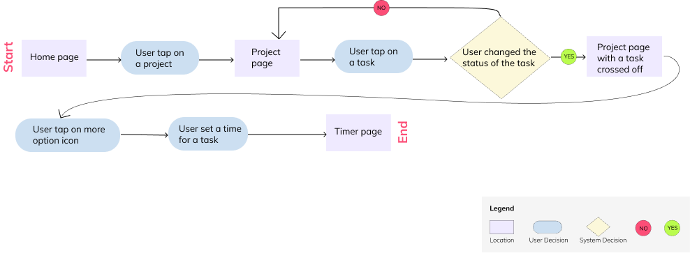
Primary Task Flow: Cross off finished task and start a timer for the next task
User story: As a new UX design graduate I want to increase my productivity so that I can complete more high-quality projects for my portfolio
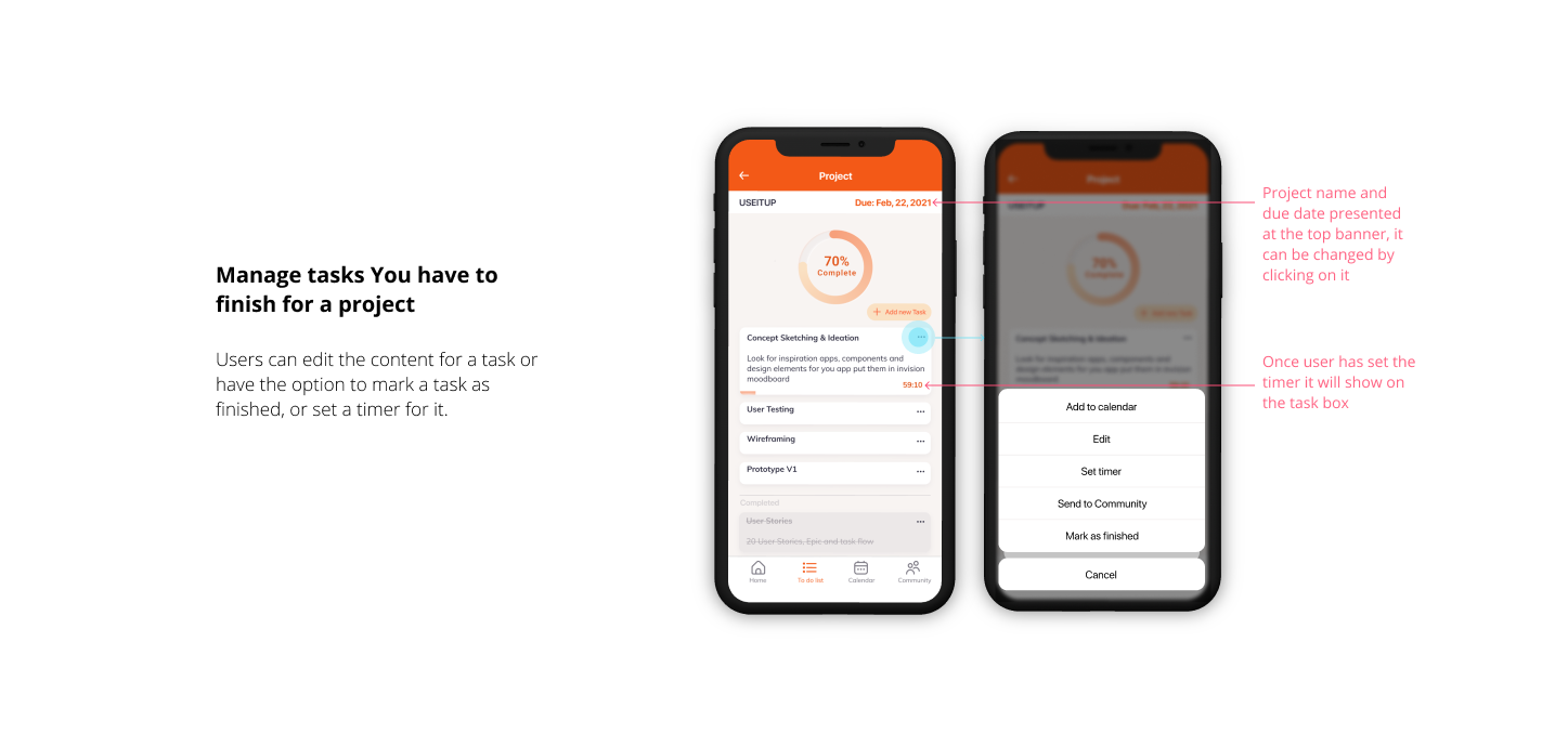
I choose this to be the primary task flow is because in order for the user to land their dream job they have to complete a portfolio that's high quality, which is crucial to whether they will land that job or not. So I believe adding a timer will help the user with focusing on a task before moving onto the next one, which will give them a more productive experience and as a result, they will produce a more high-quality portfolio to use when applying for jobs.
WIREFRAMEING
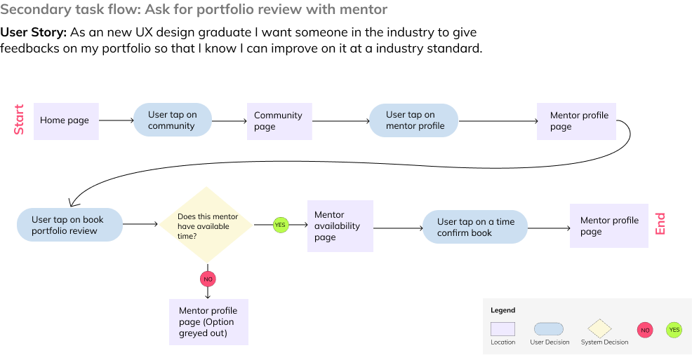
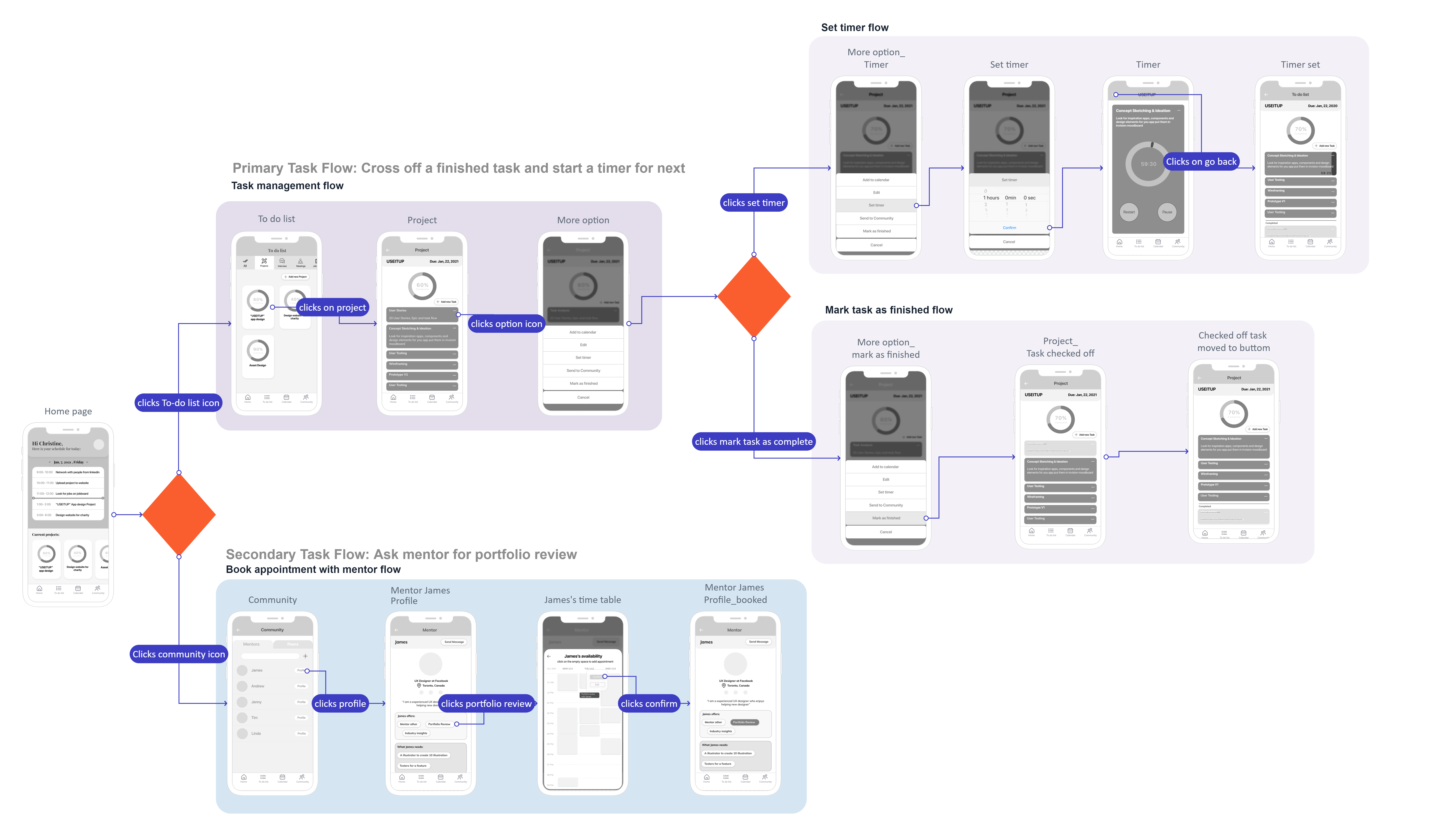
Based on the Primary Task flow and secondary task flow above I started to sketch out ideas of how the User Interface could look like. Later I created Lo-Fi wireframes to test out my solution for the user's need of wanting a place to track their tasks that are related to improving their portfolio so that they will have a better chance of landing their dream position.
USER TESTING & ITERATION
To optimize the user experience for this product
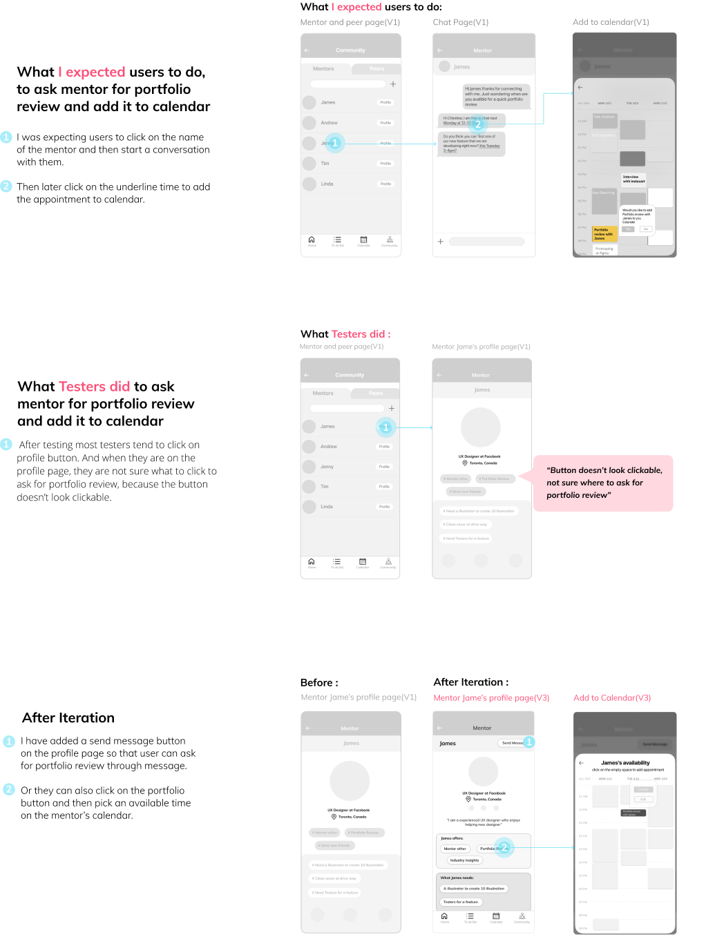
I have done a total of 10 user testings for this product so far. The purpose of the test is to see if testers are able to use the app to manage their tasks that are related to project completion, booking a portfolio with a mentor, and adding interview time to the schedule. After testing I found out that the book appointment with mentor flow had the most usability issues. Below are screens from this flow and how I iterated it based on the user's feedback.
Click Here to see the full Usability and Iteration Report
VISUAL IDENTITY
A representation of the brand and the impression this product wants the user to receive
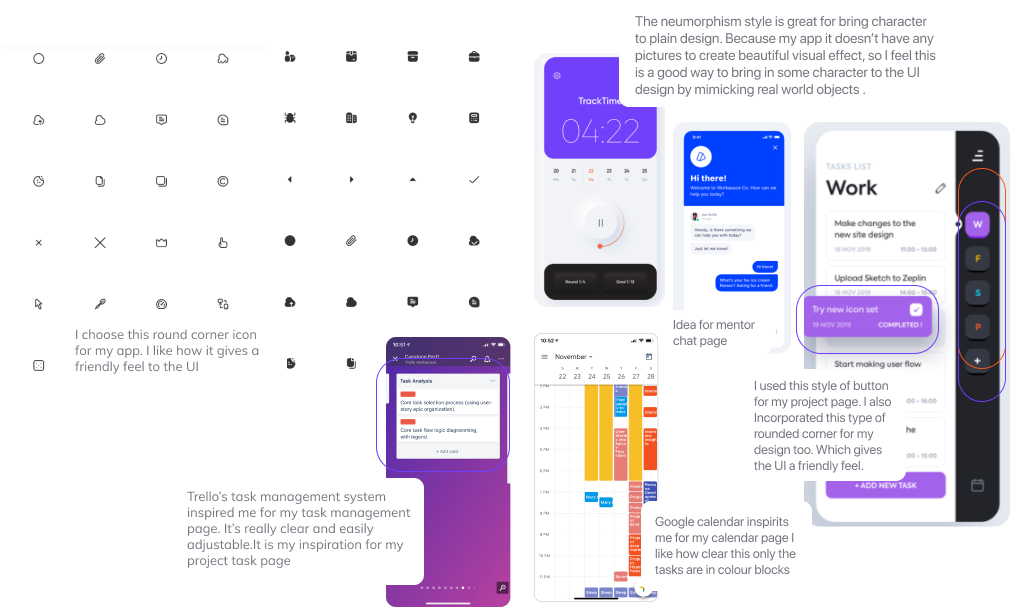
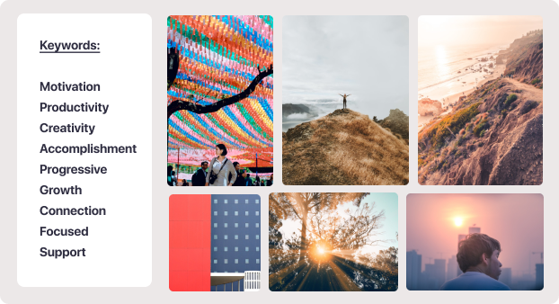
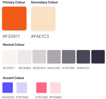
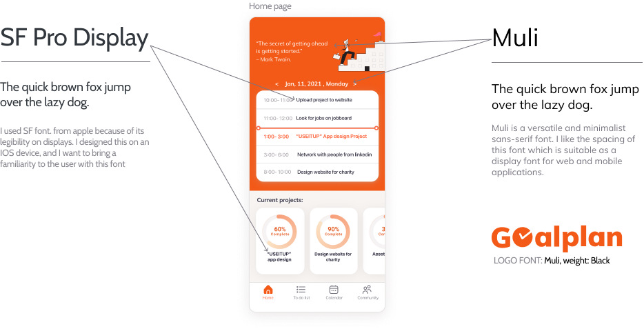
To make this prototype into high fidelity. I start thinking about the type of keywords I want to associate with this product and some of the words I came up with are Motivation, Productivity, Accomplishment, and Support. Through those keywords, I found images that can capture the mood of those words, and later I created a colour palette and used a bright orange as the primary colour to represent the brand.
MARKETING WEBSITE
Showcase the value proposition of this product
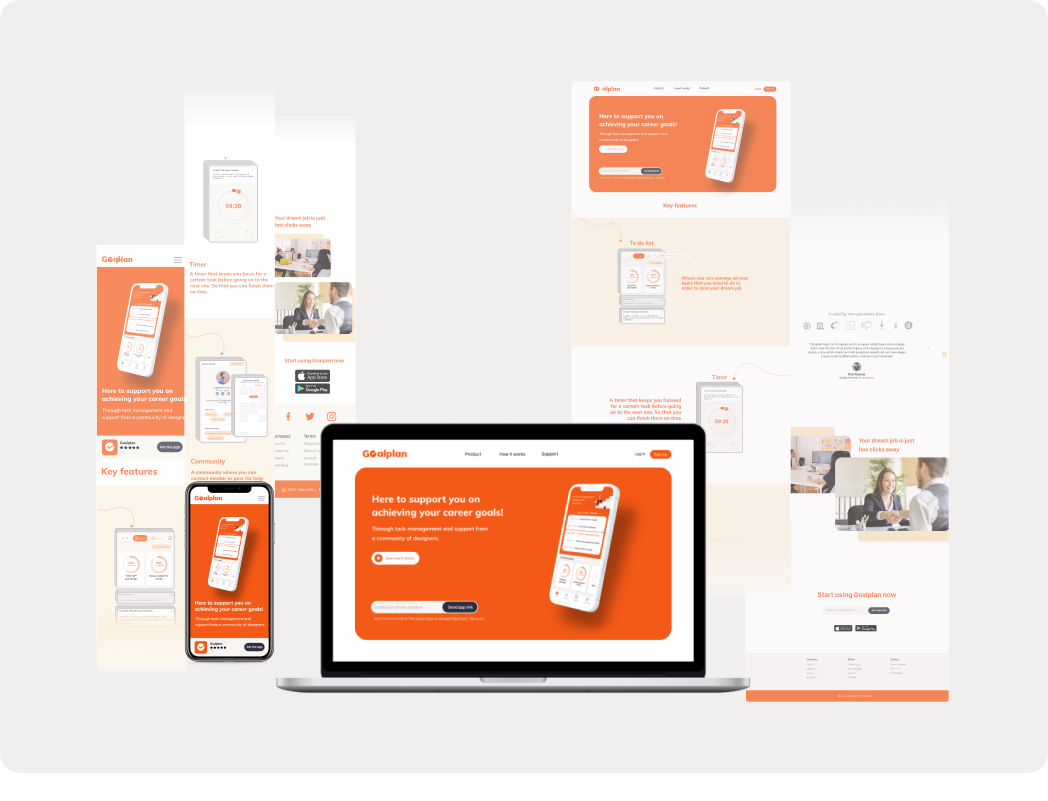
Users will likely hear about this product from their school. For example, they might find the marketing website through their school website or from an email sent from their school to show new graduates that they can use this product to help them after graduation. The website also shows how and where to download it and also social testimonials from users who have used it before. It also visualizes the outcome my users desire the most. Which is working as a UX designer or success at a job interview.
NEXT STEP FOR GOALPLAN
- I want to explore more on adding new features to the app such as syncing with other apps like LinkedIn and medium to have all the saved useful articles in one place so that they don't miss out on any important information which can contribute to their professional growth.
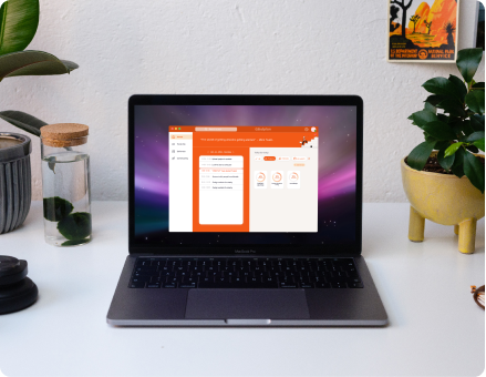
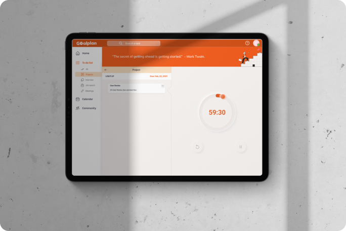
- I also want to explore creating the app on another platform such as a desktop version and Ipad version. This way it gives users a broader view of the tasks they need to finish and easier to organize them too. Here are some concept ideas of how multi-platform of the product could look like:
GOALPLAN AS DESKTOP APP
GOALPLAN AS IPAD APP
KEY LEARNINGS
- The end-to-end process of designing a product. From researching problem space, empathizing with the user to creating a Hifi prototype that solves the user's needs.
- Asking for feedbacks to receive points of view from others so that I can receive views I might not notice myself.
- Use a timer to help with focusing on a certain task before moving onto the next one which increases productivity and better time management.
- Now that I have graduated and become a new UX Design graduate I have to say this project really helped me to understand the importance of having a routine to discipline me. This way I will feel more motivated on achieving my career goals.
Let's Connect
