

Tim Horton is the nation's favourite coffee in Canada. They are committed to much more than serving great coffee. They are making a true difference for individuals, communities and the plant, every day. For this project, we redesigned the user experience of earning and redeeming points flow in Tim Hortons' app in order to better accommodate Tim Horton’s most loyal customers.
PROJECT TYPE: EDUCATIONAL PROJECT
DURATION: 3 WEEKS, DEC 2020
ROLE: PRODUCT DESIGNER
TEAM: ME, MARK PEREZ, LEONA HUANG
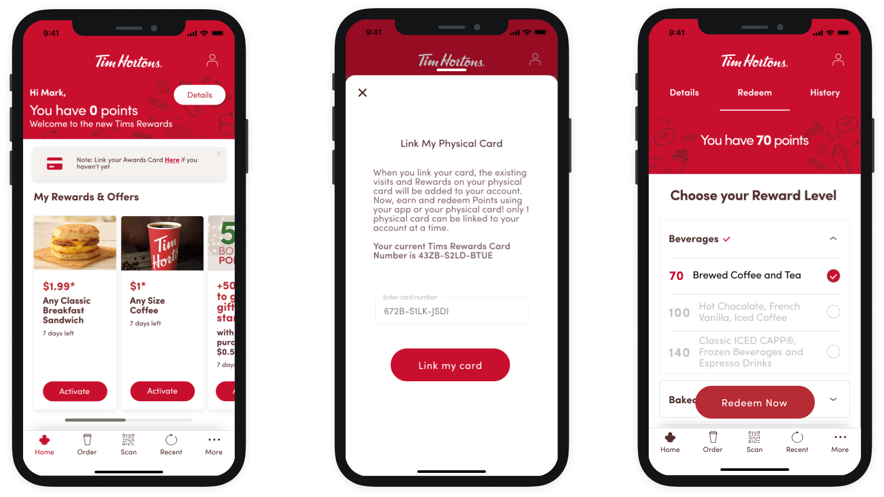
REDESIGNED FLOW FOR:
Linking rewards card and redeeming items
Click to try prototype👇
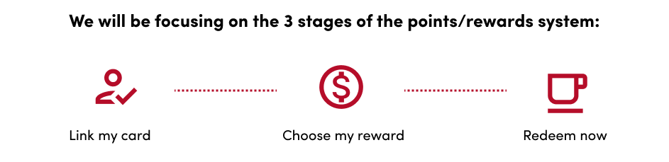
Project Goal
How might we improve the user experience of earning and redeeming points in order to better accommodate Tim Horton's most loyal customers so it will have a higher customer retention rate?
Challange & Method
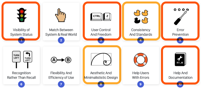
We decided to focus on this goal is because it's where most issues steamed after evaluating the usability of the app using the Neilsen Norman Group’s 10 usability heuristics. A Heuristic evaluation is a process where experts use rules of thumb to measure the usability of user interfaces with independent walkthroughs and report issues. It is used as part of the iterative design process.
Below is an image of all the 10 heuristic evaluations and we highlighted the ones we found issues within the app. I will explain more in-depth the problems we found in the following section.
Neilsen Norman group’s 10 usability heuristics
The compliance to the heuristic principles is rated as:
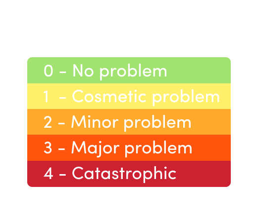
Overall we give the usability score of 2.5/4.
In the following section, I will explain how we improve the usability score so that users can be more engaged with the Tim Horton's app and eliminate the confusion around using their rewards points. This will provide them with a better purchasing experience.
-Approach and Solution-
(drag the handlebar to see before)
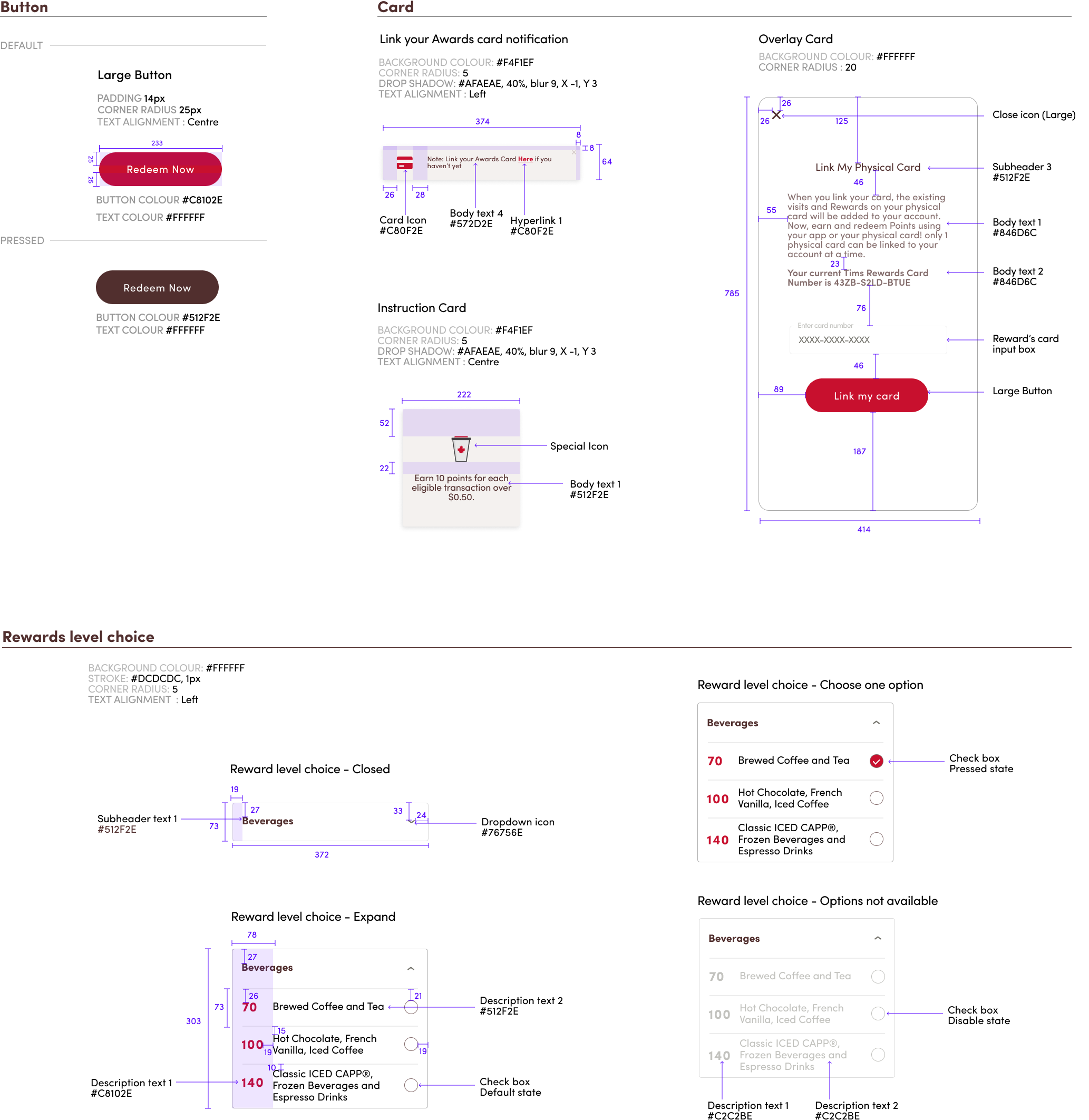
UI Library & Design System
Documentation of UI Elements that's standardized for Designers to use and developers to build.
The UI Library is created based on the method by Brad Frost called Atomic Design. There are five distinct levels in Atomic Design, they are Atoms, Molecules, Organisms, Templates and Pages. It allows the organization to roll out higher quality, more consistent UIs faster than ever before.
The following are newly designed UI Elements from this redesigned project. To view the full UI library for this project please click here.
Next Step:
- We will test the redesign rewards redeeming flow with users to receive feedback and iterate based on those feedbacks.
- Package UI elements for hand-off to the development team.
Let's Connect

